
Font pairings for pitch decks one for titles, one for everything else.
Every pairing is shown on real slides with recommended weights and sizes. All fonts are free and open source.
Editorial titles, clean body.
The most dependable structure for investor decks.


The Happy Pitch house pairing: Newsreader's news-bred serif for headlines, Inter for clean, legible body copy.
Preview pairing

High-contrast Playfair Display headlines over Lato's warm, steady text—polish without stiffness.
Preview pairing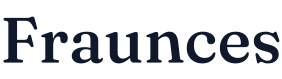

Fraunces' soft, old-style curves with Figtree's friendly geometry—a pairing that makes consumer brands feel inviting.
Preview pairing

Two members of Colophon's DM family: a punchy, high-contrast display serif and a low-contrast geometric sans.
Preview pairing

Lora's calligraphic warmth with Nunito Sans' balanced, open text—kind, clear, and easy to trust.
Preview pairing

Merriweather's robust screen serif paired with Open Sans' humanist clarity—built to survive any projector.
Preview pairing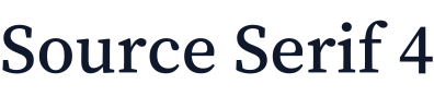
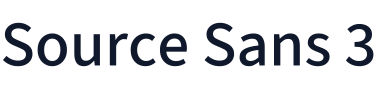
Adobe's open-source siblings: Source Serif 4 for headings, Source Sans 3 for text. Designed to sit side by side.
Preview pairing

Baskerville and Franklin Gothic, reworked for screens by Impallari Type—an American heritage pairing with gravitas.
Preview pairing

EB Garamond's Renaissance elegance over Work Sans' early-grotesque clarity—thoughtful and cultured, never fussy.
Preview pairing

Cormorant Garamond's delicate display serif with Manrope's crisp, modern text—quiet luxury on a slide.
Preview pairing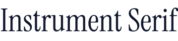

Instrument Serif's condensed display drama with its sibling Instrument Sans—made by the same designers to match.
Preview pairing
Newsreader's reporting voice with IBM Plex Sans' engineered grotesque—made for decks built on evidence.
Preview pairing
DM Serif Display's heavy-light contrast with Plus Jakarta Sans' crisp modern geometry—magazine polish for apps.
Preview pairing
Heavy Fraunces headlines with Rubik's softly rounded corners—bold and cheerful, but still businesslike.
Preview pairing
Merriweather's screen-first serif with Lexend, a sans built to make reading easier—clarity is the whole point.
Preview pairing
Lora's brushed, calligraphic serif with Roboto's no-nonsense clarity—friendly headlines, efficient everything else.
Preview pairingInstrument Serif's condensed elegance with Inter's neutral precision—a restrained, contemporary look for product-led teams.
Preview pairingModern, technical and bold.
Single-family systems, characterful display titles and technical mono headlines.
Manrope's geometric precision for headlines over Inter's screen-tuned text—minimal, modern, and quietly confident.
Preview pairing
Space Grotesk's quirky, mono-derived details over Inter's neutral body text—technical, with a sense of humor.
Preview pairing
Sora's broad, geometric headlines over Source Sans 3's economical, humanist text—a contrast of width and warmth.
Preview pairing
Poppins' near-monolinear geometry for headings with Open Sans' humanist text—approachable, familiar, highly legible.
Preview pairing
Outfit's round, geometric headlines with Work Sans' grotesque-rooted text—energetic, contemporary, and tidy.
Preview pairing
Raleway's refined, display-minded sans for headings over Lato's warm, sturdy text—elegance without a serif.
Preview pairing
Bricolage Grotesque's quirky, expressive headlines with Figtree's friendly clarity—fun that still reads as competent.
Preview pairing
Syne's art-world display shapes with DM Sans' calm geometry—an unmistakable voice for culture and creative brands.
Preview pairing
Bebas Neue's tall, condensed capitals with Roboto's plainspoken text—maximum headline impact, zero confusion below.
Preview pairing
Montserrat's wide, poster-inspired headlines over Lora's readable, calligraphic text—punchy titles, human storytelling.
Preview pairing
Archivo's tough grotesque headlines over Source Serif 4's crisp transitional text—industrial strength, reader's patience.
Preview pairing
IBM Plex Mono headlines with Plex Sans text—one engineered superfamily, built for deep tech and hard data.
Preview pairing
Space Mono's geometric, retro-leaning headlines over Work Sans' clear text—technical, opinionated, and human.
Preview pairingCommon questions. Clear answers.
How do I pair fonts for a pitch deck?
Can I use one font for the whole deck?
Raising soon? Don't leave it to chance.
Drop your details and we'll send a free deck audit — then jump on a 15-minute intro call to walk through exactly what to fix before you pitch.
- We reply within 24 hours
- Complete founder confidentiality
Got it — your audit is on the way.
We'll review your details and reply within 24 hours. Want to fast-track it? Grab a 15-minute intro call now.
Book your intro call