
Best fonts for pitch decks seen on a real slide.
40 free, open-source fonts chosen for investor decks — each with a live specimen, recommended slide sizes and the fonts it pairs with.
Four rules for deck typography.
Use two fonts, not five
One for slide titles, one for everything else. Create hierarchy with size and weight instead of more typefaces.
Design for the back of the room
Body text below 14 pt disappears on projectors and compressed video calls. Titles should read in a two-second glance.
Let the serif carry the voice
An editorial serif for titles adds credibility; a neutral sans keeps numbers and body copy effortless to read.
Export a PDF to share
Fonts only travel with the file if they're embedded. A PDF guarantees investors see the deck exactly as designed.
Clean, modern sans-serifs.
The workhorses for body copy, charts and product screenshots. Almost every deck needs one.

A screen-first neo-grotesque with a tall x-height and crisp numerals — the safest neutral choice for data-heavy SaaS decks.
See it on a slide
Google's Android-era workhorse: a mechanical skeleton with open, friendly curves — very legible, but so familiar it can read as default.
See it on a slide
Steve Matteson's humanist workhorse with wide-open letters and an upright stance — readable anywhere, but extremely widely used.
See it on a slide
Wide geometric letters inspired by old Buenos Aires signage — punchy in titles, but everywhere and hungry for horizontal space.
See it on a slide
Near-perfect circles and even strokes make Poppins approachable and upbeat — and one of the most recognizable fonts in startup decks.
See it on a slide
Łukasz Dziedzic's "summer" sans: classical proportions with softly rounded details — serious but warm, and reliable in body text.
See it on a slide
Wei Huang's grotesque, loosely based on early grotesques and tuned for mid-size screen text, with display-ready extreme weights.
See it on a slide
Colophon's low-contrast geometric, derived from Poppins but tighter and built for small sizes — friendly without the bulk.
See it on a slide
Mikhail Sharanda's geometric-grotesque hybrid with compact, slightly squarish rounds — tidy, technical and easy to read in data.
See it on a slide
Tokotype's geometric sans, first made for Jakarta's city branding — tall x-height, open counters and a crisp, upbeat tone.
See it on a slide
A crisp geometric sans with circular bowls and nine weights from Thin to Black — minimal and friendly, though it has no italics.
See it on a slide
Barnbrook and Moncada's wide, technical geometric sans, first made for a decentralized-economy project — it instantly reads as tech.
See it on a slide
Florian Karsten's proportional spin-off of Space Mono, keeping its odd, retro-technical details — a sans with a coder's accent.
See it on a slide
IBM's corporate grotesque, with machined transitions where curves meet stems — rational and trustworthy, with subtle quirks.
See it on a slide
Paul D. Hunt's Adobe sans with American gothic roots — narrow, clear and efficient, ideal when slides carry more text.
See it on a slide
The straight-terminal sibling of rounded Nunito: balanced, gently geometric letters that feel warm and clear without going soft.
See it on a slide
Begun as a single thin weight, Raleway is an elegant display sans with a crossed-stroke W — and old-style numerals by default.
See it on a slide
A sturdy sans with softly rounded corners, first drawn by Hubert & Fischer for a Rubik's Cube project — friendly but grounded.
See it on a slide
A clean, friendly geometric sans by UI designer Erik Kennedy — warm like Poppins, but more compact and calmer in text.
See it on a slide
Built on Bonnie Shaver-Troup's reading-proficiency research, with wide spacing and simple shapes — exceptionally easy to read.
See it on a slide
Omnibus-Type's sturdy grotesque, made for headlines and high-performance text — direct, compact and strong in heavy weights.
See it on a slide
A crisp contemporary grotesque in Regular to Bold — precise, a little editorial, and made by the team behind Instrument Serif.
See it on a slide
Impallari Type's open-source take on Franklin Gothic — a sturdy, newsy American gothic that gives decks an authoritative voice.
See it on a slideEditorial serifs for headlines.
Add credibility and a distinct voice to slide titles. Pair with a sans for body text.

A screen-first news serif with a lively italic and a full weight range—serious enough for finance, warm enough for consumer stories.
See it on a slide
A high-contrast display serif with razor hairlines and a large x-height—striking at headline sizes, fragile in small text.
See it on a slide
A chunky, soft-edged old-style serif with retro warmth—friendly headlines from hairline-light 100 to heavy 900.
See it on a slide
A single-weight, high-contrast headline serif with tight spacing and a graceful italic—instant polish for cover and section slides.
See it on a slide
A balanced contemporary serif with brushed, calligraphic curves—readable as body text and friendly in headlines.
See it on a slide
A sturdy screen serif with a large x-height and slightly condensed letters—one of the most legible serifs for slide body text.
See it on a slide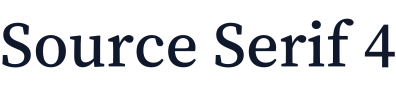
Adobe's open-source transitional serif in eight weights—clean for body text, sharp for titles, built to sit beside Source Sans.
See it on a slide
A Baskerville adapted for screens with a taller x-height and wider counters—classic authority that stays readable at text sizes.
See it on a slide
A faithful revival of Claude Garamont's Renaissance types—graceful and literary, but small on the slide and best used large.
See it on a slide
A sharp, delicate Garamond-style display serif with a tiny x-height and fine hairlines—gorgeous huge, unreadable small.
See it on a slide
A condensed, single-weight display serif with a sleek italic—the editorial headline look that suits design-led product brands.
See it on a slidePersonality for big moments.
Use sparingly on covers, section dividers and the one number you want remembered.

A characterful grotesque with ink-trap notches and a big x-height—headlines feel energetic without tipping into novelty.
See it on a slide
An art-world display sans whose letters grow dramatically wider as the weight increases—made for loud, short headlines.
See it on a slide
A tall, condensed all-caps sans that fits big words into narrow spaces—ideal for headline numbers and section labels.
See it on a slideTechnical accents.
For code, data labels and decks for developer-facing products.

A developer-first monospace with a tall x-height and clear, simple shapes—the right accent for code, APIs and metric labels.
See it on a slide
IBM's corporate monospace, with squared curves and slab-like details—technical, but more formal than most code fonts.
See it on a slide
A retro-futuristic geometric monospace in regular and bold—full of personality for titles and labels, too quirky for long text.
See it on a slidePairings that just work.
Curated heading and body combinations, each with live slide previews.
The Happy Pitch house pairing: Newsreader's news-bred serif for headlines, Inter for clean, legible body copy.
Preview pairingHigh-contrast Playfair Display headlines over Lato's warm, steady text—polish without stiffness.
Preview pairingFraunces' soft, old-style curves with Figtree's friendly geometry—a pairing that makes consumer brands feel inviting.
Preview pairingTwo members of Colophon's DM family: a punchy, high-contrast display serif and a low-contrast geometric sans.
Preview pairingLora's calligraphic warmth with Nunito Sans' balanced, open text—kind, clear, and easy to trust.
Preview pairingMerriweather's robust screen serif paired with Open Sans' humanist clarity—built to survive any projector.
Preview pairingFrom fonts to a finished look.
Ten complete deck styles: palette, type pairing, layout rules and example slides.
Minimal
White space, one accent color, one idea per slide. The minimal style lets strong numbers and sharp claims carry the deck.
See the styleEditorial
Magazine-style serif headlines, cream paper tones, and pull quotes. Editorial decks make a company's story feel reported, not sold.
See the styleBold
Saturated color, oversized condensed headlines, and one huge number per slide. Bold decks are built to be remembered after the meeting.
See the styleCommon questions. Clear answers.
What is the best font for a pitch deck?
Should a pitch deck use serif or sans-serif fonts?
What font size should I use in a pitch deck?
Raising soon? Don't leave it to chance.
Drop your details and we'll send a free deck audit — then jump on a 15-minute intro call to walk through exactly what to fix before you pitch.
- We reply within 24 hours
- Complete founder confidentiality
Got it — your audit is on the way.
We'll review your details and reply within 24 hours. Want to fast-track it? Grab a 15-minute intro call now.
Book your intro call